Crosswalk
A paradigm-shifting technology in the real estate space needed a visionary brand.
Insight
In a sector littered with made-up names and acronyms, we knew that the new name had to be memorable and make sense. Like Google, it had to be employable within a real-life environment and work as both a noun and a verb. It also had to work semantically and phonetically so that it sounded right and said the right things. A tall order. Beyond the name, the brand needed to align with the most sophisticated technology tools sweeping the industry, including Building information modeling (BIM), Augmented reality (AR) and Virtual Reality (VR), and 3D printing.The Answer
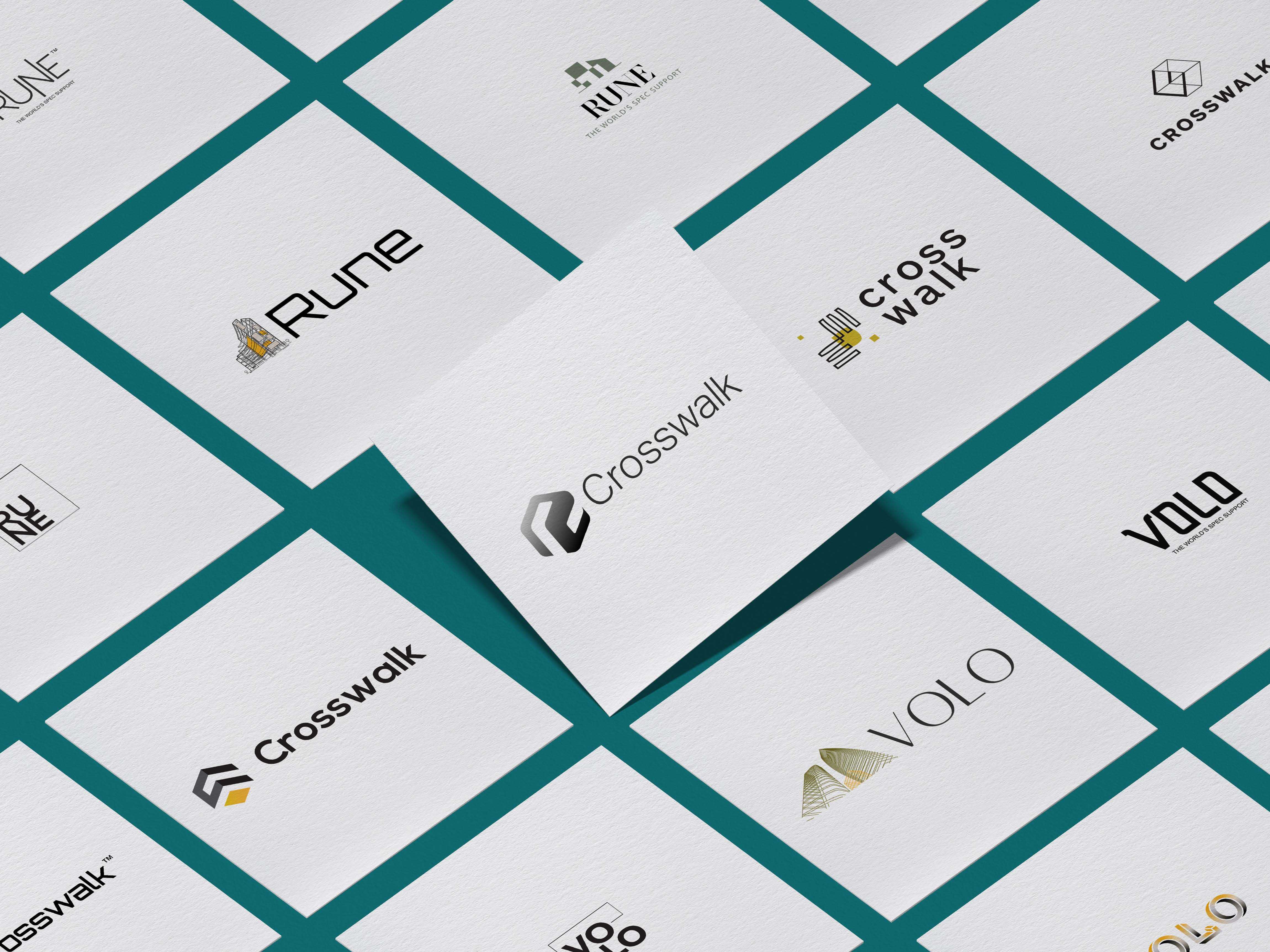
Mobilizing our team of strategists, copywriters, and a classical languages scholar, we explored over 100 names, including words in Anglo Saxon, Latin Greek, and newly minted words. The winner was a name that perfectly described the convergence of information and data that Crosswalk represents. We then engaged our three designers to work in parallel on a logo mark for the new brand. After concepting 15 different marks, the client selected a dramatic 3D logo that evokes the history of computing and evokes a digital engine.Our writers’ room of strategists, copywriters, and a classical languages scholar explored over 100 names for the product, including words in Anglo Saxon, Latin, Greek, and newly-minted words.
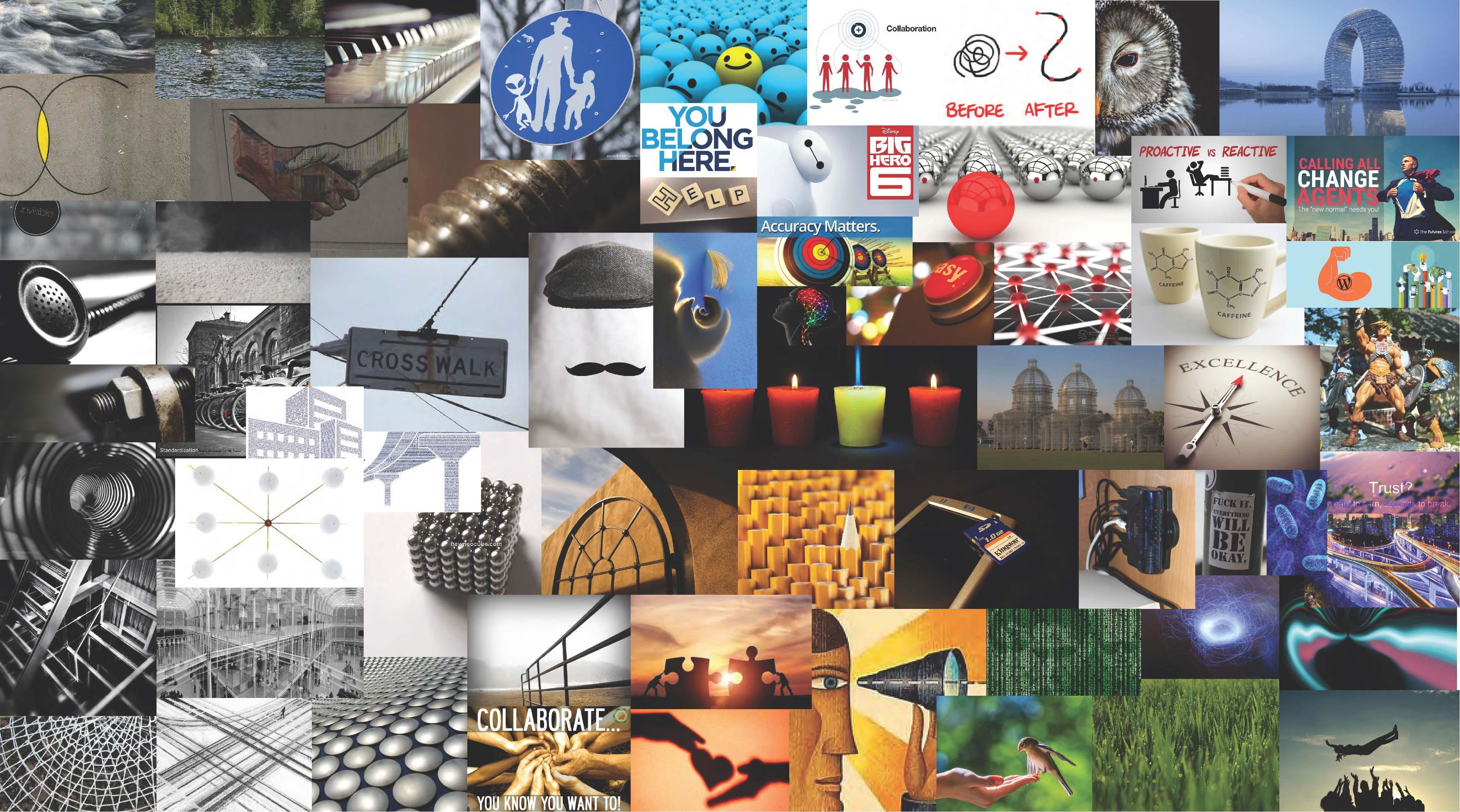
We recruited the executive team to be a co-designer in the process by having them choose images for the Crosswalk moodboard.
We presented 15 logos for Crosswalk and shortlisted them to three. The final chosen was a 3D pictogram that evokes a digital engine as well as the early days of computing.
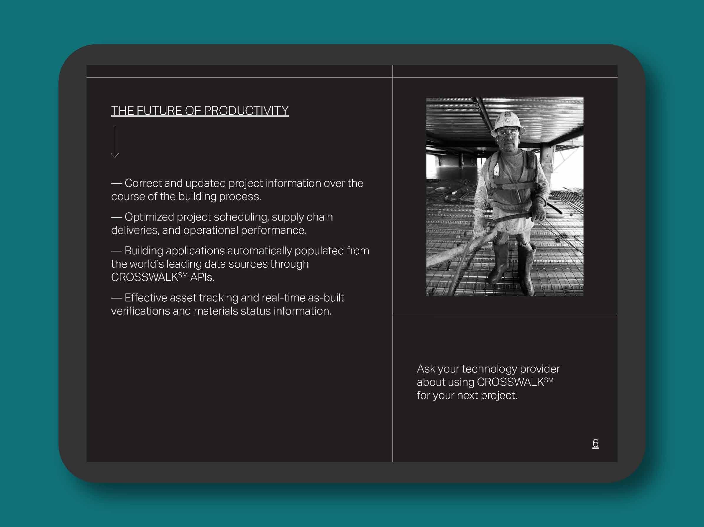
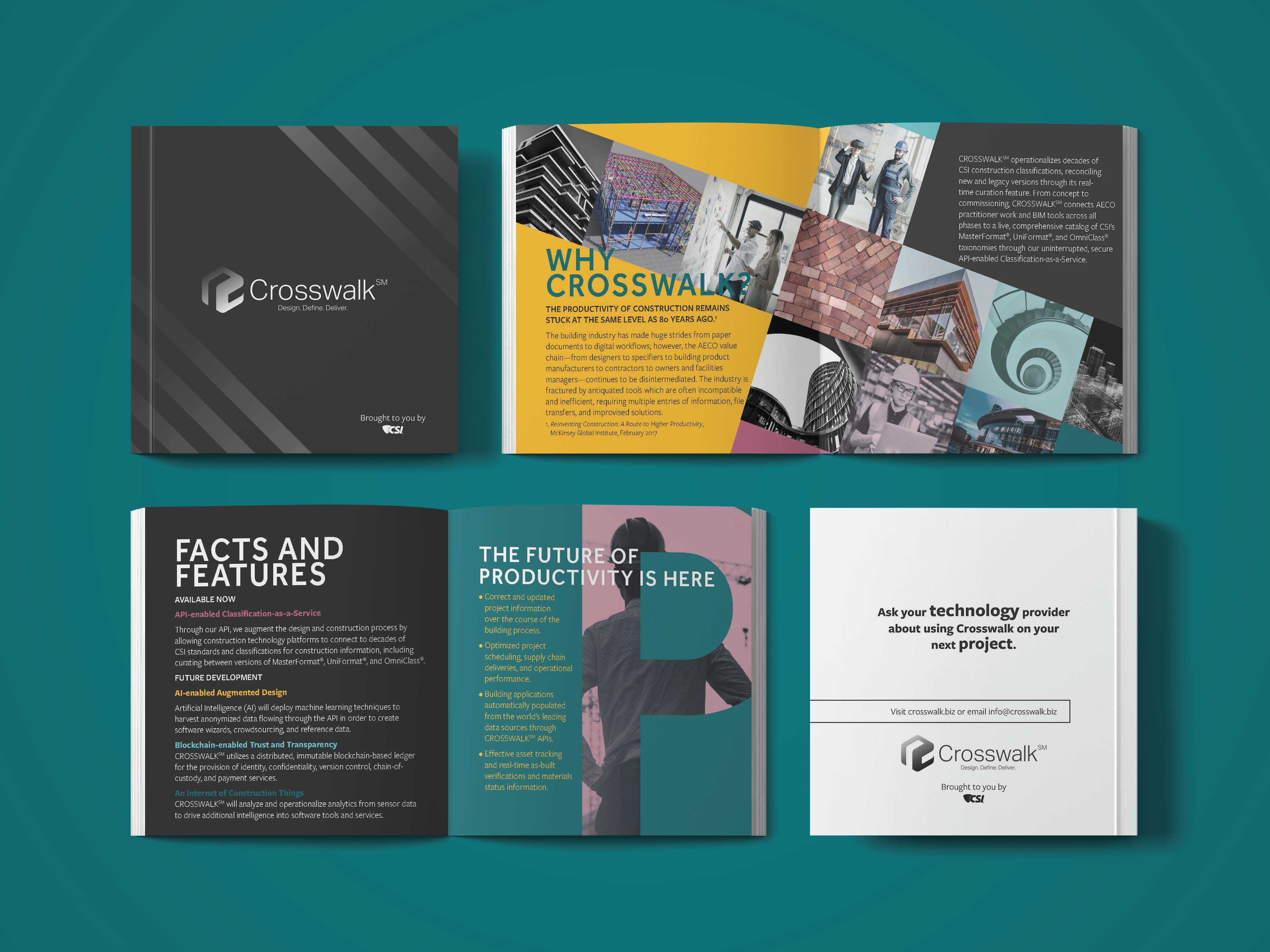
We designed two alternate Crosswalk brochure versions—one austere Bauhaus and the other a whimsical art deco version.